


INTERIOR DESIGN COLOR COMBINATION PRINCIPLES
NOT EVERYONE KNOWS!!
Color is frequently the most difficult aspect of interior design for a room, needing the most careful choices to create the perfect result. There are numerous color groups to pick from, and these colors must be combined in the proper proportions. Generally, we should only utilize 3-4 colors in a room, and there are a few principles to follow to achieve color balance in the space. Follow the guidelines below to finally master color in home design!
1. Rule 60 - 30 – 10


 Any interior designer will benefit from the 60-30-10 rule. This rule can be used to ensure that your room always has a color balance, regardless of your particular taste or how you want it to look. You will use three colors in one room for this regulation. Each color's percentages in the space are 60, 30, and 10. The following rule is followed: First, you select a dominant hue that will take up approximately 60% of the room. To avoid overwhelming the decor, this is usually a neutral or light-tone color.
2. The color contrast between hot and cold tones
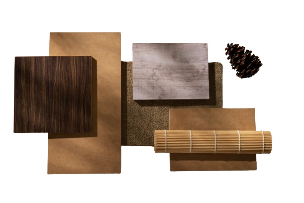
On the color wheel, both the warm and cool color groups are represented. Warm colors are those that are more bright, such as red, orange, or yellow. This color category also includes neutral colors like brown and bark. In contrast to warm hues, cold colors include blue, green, purple, and even gray.


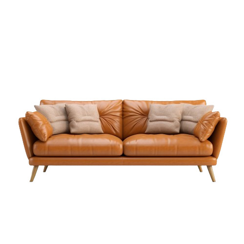
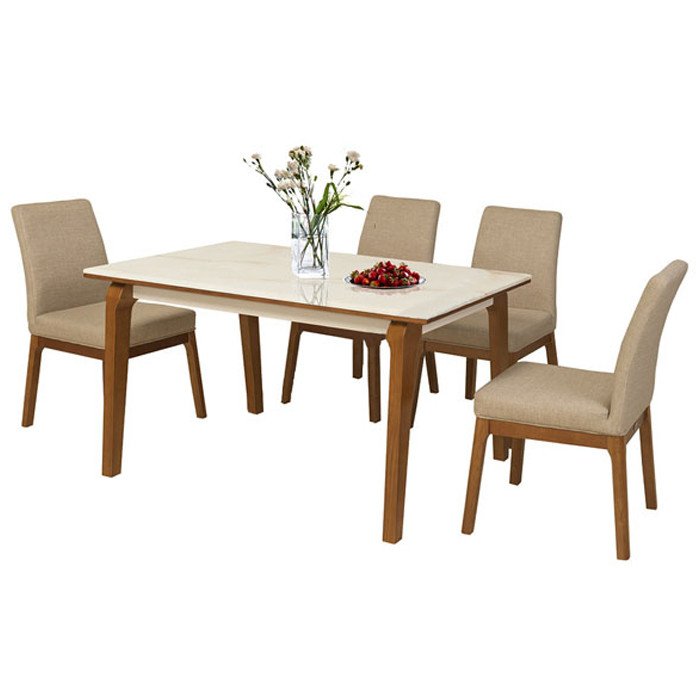
- The area's vitality will be affected by the choice of warm or cold hues. Warm hues, which are generally advised in entertainment spaces, tend to add a sense of optimism and enthusiasm to a place. Consider incorporating this color scheme into your dining room or kitchen.
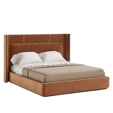
- The cool color group, on the other hand, offers a more calm vibe. Cool tones are frequently employed in bedrooms and offices where soothing, peaceful energy is required.
3. Complementary color schemes – Combine 2 colors that are symmetrical on the color wheel
The most basic color rules used by interior designers are complementary color schemes. If you wish to choose two colors for a space, choose two colors that are symmetrical on the color wheel. Colors that are opposite each other on the color wheel typically provide good visual effects; for example, blue and orange, yellow and purple, and red and green can all be used in the same space.

 The purple and gold symmetrical color combo has high contrast and adds a lot of vitality to the room
4. Analogous color schemes combine colors that are adjacent to the color wheel
 If you have difficulty using the color wheel, a similar color scheme may be for you. For this guideline, while selecting colors for a space, choose a central color and then utilize two more colors next to it. One of the three hues chosen is a combination of the other two, such as red, orange, and yellow, or red, purple, and blue. When using three colors side by side, the color of the space must be suitably scaled to provide balance and harmony. To keep the ratios in check, remember the 60 - 30 - 10 guideline. Remember that you may utilize different tones of the same hue to generate visual variety. Color tones fade from outside to center on the color wheel.


 If you don't like bright colors, you can create a monochrome palette by using only neutral hues (black, white, and gray). All you have to do is combine black and white to produce the desired color. Colors derived from neutrals are frequently appropriate for modern and youthful architectural environments.
ADORN MUSEUM
Location: O-1, TM.01, 1st Floor, Orchid 1 Tower, Hado Centrosa Garden No.200 3/2 Street, Ward 12, District 10, Ho Chi Minh City, Viet Nam.
Hotline: (+84) 28 3930 3428
E-mail: support@adornmuseum.com
Operation time:
8:30 - 17:30, Monday - Friday & 8:30 - 12:00, Saturday